
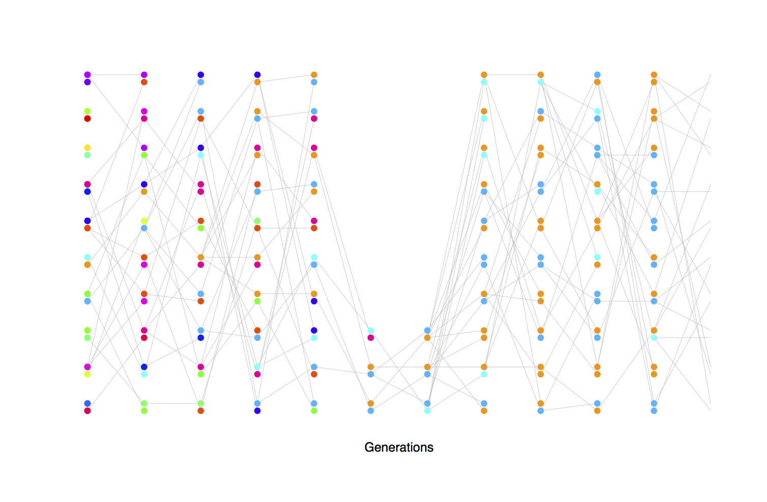
Figures are really useful for explaining concepts like drift, however, I often find textbook figures are not super helpful. Pictures of hands reaching into jam jars of beans etc are useful metaphors but don’t really depict the process of transmission (also drift is sampling with replacement, so I’m never sure what process is really being depicted by a handful of beans). In addition it helps to be able to show multiple realizations of drift to show the randomness of drift, so multiple simulations help. Dor my undergrad teaching this quarter I set myself the task of generating R code and figures to better depict drift in diploid populations. In these figures each generation is a vertical column, with each diploid individual having a two of alleles. All of the alleles are neutral with respect to each other. In each offspring generation, two random parents are chosen for each offspring, and one of each parents alleles are chosen at random.
My R code to produce these figures, and ones like them is on github here. Feel free to reuse/repurpose the figures and code. If you find them useful leave a comment, or suggest ways they could be improved. I’ve already started to integrate figures like them into my popgen notes [pdf here].
In the first set of simulations I show the loss of heterozygosity over time, in the absence of new mutations

(in the figures below I use grey lines to show descent, but they don’t show up well on projectors in class, so I’ve included a link to a bunch more with black lines in a pdf below).
Tracking different alleles with colours

Genetic drift during bottlenecks leads to the rapid loss of genetic diveristy, particularly rare alleles, but can also by chance increase the frequency of rare alleles.
Repeated bottlenecks (fluctuating population size) speed the rate of genetic drift, and even large populations can have a fast rate of drift (i.e. a smaller effective population size) if they sometimes under go bottlenecks

Depiction of the fact that high variance on reproductive success increases the rate of genetic drift (decrease the effective population size). The circled individuals are randomly chosen individuals who have much higher reproductive success than other individuals (contribution to 25% of offspring each). Note the large number of descendent lines originating from there:

Mutation-drift equilibrium, mutations new colours are introduced in the transmission in 10% of transmissions (a unrealistically high mutation rate, but given the small population size it illustrates the point). Initially the population has only one type of allele but mutation is constantly introducing new alleles, which drift up and down in frequency, leading to an equilibrium level of diversity in the population

Mutation-Drift equilibrium tracking the frequency of alleles over time:
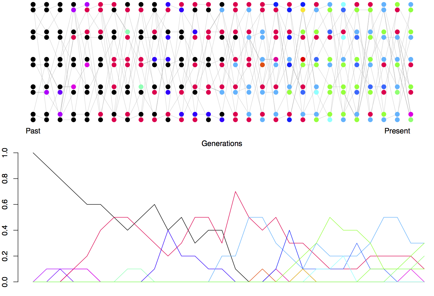
Note that many newly mutated alleles drift into the population but are quickly lost.
A bunch more simulations of these types are in this pdf.
Trevor Bedford also has a nice set of simulation figures as well.

Pingback: Figures of Incomplete Lineage Sorting | gcbias
These are great, Graham! Thanks for making them available and providing the R code. I just used a bunch in a guest lecture I gave in Scott Edwards’ Molecular Ecology and Evolution class and they were very helpful.
Hi Tim. Great, glad they were useful! Feel free to suggest improvements.
Will be hopefully updating them this quarter.