Population genetics course resources: Demostrating the uses of coalescent simulations

A problem set making use of the coalescent simulations the students wrote for a previous exercise (see here). They use the code to calculate p-values for the observed number of segregating sites, this could be done under the HKA test but it’s nice to get them to use their simulations. They also use the code to do rejection sampling to get the distribution of the time to the most recent common ancestor given the number of segregating sites (this idea is taken from Tavare et al 1997). This exercise could be extended in a number of ways, e.g. as in Tavare et al 97 we could simulate from a prior on theta. I’d also like to get the students to use ms to infer parameters of a bottleneck model (e.g. from Tajima’s D).

Q3) You sequence 11 loci of 1000bp in a species of dolphin. In your sample of 10 individuals you observe the following number of segregating sites:
41, 48, 43, 48, 23, 45, 5, 56, 48, 25, 83
Assume (based on prior knowledge from divergence) that these 12 loci have identical mutation rates (of 2×10⁻⁸ per base per generation) and that there is no recombination within these loci (not a particularly great assumption).
A) What is your best estimate for the effective population size?
B) There seems to be substantial variance in the number of segregating sites across loci, perhaps because some of them are linked to loci undergoing selection. Assuming a constant population size, and your estimate of Ne from part A, use your coalescent simulations to estimate a p-value that the data at each of these loci was produced by the neutral coalescent model.
C) Which loci are candidates (at a false positive rate of 0.05) for being influenced by linked selection? What kind of selection could explain your observations? What other aspects of the data could you look at to distinguish these hypotheses? Are your conclusions robust to the assumptions we have made?
D) Your colleague sequences a 500bp region (which putatively has the same mutation rate) in the same 10 individuals. He finds 12 segregating sites. He tells you that he thinks this region has unusually low diversity because it is linked to a locus under selection. Using your simulations comment on whether his story is plausible.
E) He asks you whether he can estimate the time to the most recent common ancestor (TMRCA) for his locus based on the number of segregating sites and your estimate of Ne. Can you extend your coalescent simulations to estimate the distribution of the TMRCA at his locus? [Hint you will need to modify your coalescent code to produce both the TMRCA and number of segregating sites.]

Creative Commons License
This work is licensed under a Creative Commons Attribution 3.0 Unported License.

Posted in popgen teaching, Programming exercises, teaching | 1 Comment

Journal tea: Dec. 6th

For tuesday let’s read:
Kunte et al Sex Chromosome Mosaicism and Hybrid Speciation among Tiger Swallowtail Butterflies

Posted in journal tea | Leave a comment

Yaniv back from Vienna.

Yaniv is back from trip to see Nick Barton and others in Vienna. You can read more about his trip here. I’m surprised they let him back into the country as he didn’t bring a present for the lab ;).

Posted in Uncategorized | 1 Comment

Population genetics course resources: Modeling a serial bottleneck out of Africa.

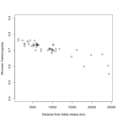
The decreasing level heterozygosity as a function of distance from Africa in human populations is one of the pieces of evidence for the (mainly) out-of-Africa model, see here for a review. This observation is consistent with a serial population bottleneck as populations moved out of Africa and around the world (or in a continuous spatial model increased drift at the front of the wave of advance). Obviously the interpretation of this gradient is complicated by the recent findings of low levels of potential archaic admixture, but the empirical observation still holds and offers an interesting exercise.

In this exercise the students create a serial bottleneck model, and fit its parameters to human data. The exercise gets them to think about modeling the loss in heterozygosity in a different setting, and fit the parameters of a model. The model and data come from Ramachandran et al 2005, thanks to Sohini for sending along the data. If I assign the exercise again I’ll trying and guide the students a little more as they struggled slightly with knowing how to fit the model.

The data file and script are available here.

Exercise:
Download and run the R script: HGDP_He_vs_dist_from_Africa.R. The Human Genome Diversity panel (HGDP) is a set of 53 human populations sampled from around the world, taken from Ramachandran et al. 2005 (thanks to Sohini Ramachandran for sending me these data). The data and graph give the heterozygosity in HGDP populations as a function of the distance from Addis Ababa, Ethiopia. The distances are calculated to avoid large bodies of water. The increasing reduction in heterozygosity has been interpreted as evidence for a set of serial bottlenecks as human populations moved out of East Africa and around the world.
The following model taken from Ramachandran et al. 2005 is a (overly) simple model of human colonization through a series of bottlenecks:
1)An initial population of humans starts in Addis Ababa, with a heterozygosity H.
2) From the Addis Ababa population a new population is founded by D individuals moving a distance R away. This population instantly grows to a very large size (near infinite), with no subsequent migration in or out of the population.
3) From the 2nd population, a 3rd population is founded by D individuals a distance R away, such that this new population is 2R away from Addis Ababa. This 3rd population also instantly grows to a very large size (near infinite size), with no subsequent migration in or out of the population.
This serial founding of new populations continues until a string of populations have been established all the way from Addis Ababa to Brazil (home of the Karitiana people), a distance of over 24000km.
What is the relationship between the heterozygosity and distance from Addis Ababa? Assuming that D is not small, can we hope to distinguish D and R? Using the Ramachandran et al. 2005 data estimate the parameters of this serial bottleneck model. [Useful command: lm() – linear model).

HGDP<-read.table("HGDP_hetsdistfromAfrica.txt",as.is=TRUE,head=TRUE)
plot(HGDP$corrdistEth,HGDP$He,ylim=c(.4,.9),xlab="Distance from Addis Ababa (km)",ylab="Microsat. Heterozygosity")


If you do use these scripts and figures, please acknowledge that fact (mainly so that others can find this resource). Also if you do use them it would be great if you could add a comment to the post so I can see how widely used they are, to get a sense of how worthwhile this is. If you find a bug or make an improved version do let me know.

Creative Commons License
This work is licensed under a Creative Commons Attribution 3.0 Unported License.
Posted in popgen teaching, Programming exercises, teaching | Leave a comment

journal tea: Nov. 22nd

For Tuesday let’s read Beaumont and Balding’s paper: Identifying adaptive genetic divergence among populations from genome scans

Posted in journal tea | Tagged , | Leave a comment

Population genetics course resources: Coding up the coalescent time distribution.

A homework exercise coding up a coalescent model in a constant population of size N. There’s a variety of ways this could be done, the code is setup to guide a person through one of those. The code is applied to working out the time to speciation under the genealogical species concept as an example of the application of coalescent thinking (see Hudson and Coyne for a deeper analysis of this problem). Two other obvious applications that will be next up are: 1) calculating the probability of an observed number of segregating sites; 2) working out the distribution of the time to the most recent common ancestor conditional on a number of segregating sites.


##The R assignment for this week is to write code to simulate the times in coalescent trees and the number of segregating sites.
## We'll simulate the to the common ancestor of our sample, the total time in our coalescent and then the number of segregating sites.

#write function below to simulate the Time to the Most Recent Common Ancestor (TMRCA) for n sequences sampled from a population of N diploids
##In this function you'll need to use the rexp function to simulate a single draw from an exponential r.v. 
TMRCA=function(n,N){
	
	
	return(tmrca)
	}


##EXERCISE 1
##Write a for loop to iterate your TMRCA function 10000 times, recording each value returned by your function
##you could alternatively use the function replicate() to do this loop.
##plot a histogram of the distribution of the TMRCA, and calculate the mean and variance
##Do this for two different values of N=10000 and 1,000,000 and a few different sample sizes, e.g. n=2, n=5 and n=1000 (try other values as well)
##Hand in these histogram, means and variances and briefly comment on the numbers you obtain and how they compare to the results we've developed in class

##EXERCISE 2
# There are many concepts of what a species is, one species concept is the phylogenetic species concept (PSC). Under this species concept (crudely speaking), a population would be considered a separate species if at 90% of loci in the genome of a population are monophyletic with respect to any sister population (this is the genealogical species concept (GSC), a variant of the PSC). 
# Imagine a population has been totally isolated from all other populations. Can you use your coalescent simulations to gain an approximate sense of the time till the population would be declared a separate species by (this admittedly crude representation of) the GSC. 
# Many population geneticists, while recognizing the usefulness of a clear definition of a species, are some skeptical of the application of this species concept. This is especially true of population geneticists (perhaps now the majority) who see adaptation as playing the key role in the accumulation of reproductive isolation factors. Can you explain why?
#[Read Hudson and Coyne’s  paper (http://www.jstor.org/pss/3061538) on this topic if you want a deeper analysis of this problem.]

##EXERCISE 3
	
	##Alter this function to simulate the total time in the genealogy for n sequences sampled from a population of N diploids
tot.time=function(n,N){
	

	return(tot.time)
	}


##Write a for loop to iterate your total time function 10000 times, recording each value returned by your function
##or use replicate()
##plot a histogram of the distribution of the TMRCA, and calculate the mean and variance
##Do this for two different values of N=10000 and 1,000,000 and two different sample sizes n=5 and n=100 (try other values as well)
##Hand in these histogram means, variance and briefly comment on the numbers you obtain and how they compare to the results we've developed.	

u=1e-8

## Write a for loop to iterate your total time function 10000 times, and each iteration simulate a number of segregating sites given the total time in the tree.
## You'll need to make use of the function rpois(n=1,lambda), which simulates a single draw from a Poisson with a mean lambda.  
##record the number of segregating site for each iteration
##try a couple of different values of the mutation rate u (e.g. u=1e-7 and 1e-4 represents a region of roughly ten bases and 10000 bases) for the two N's given above.
##plot a histrogram of the number of segregating sites across your simulations, calculate the mean and variance
##Hand in these histogram means, variance and briefly comment on the numbers you obtain and how they compare to the results we've developed.


If you do use these scripts and figures, please acknowledge that fact (mainly so that others can find this resource). Also if you do use them it would be great if you could add a comment to the post, so I can see how widely used they are, to get a sense of how worthwhile this is. If you find a bug or make an improved version do let me know.

Creative Commons License
This work is licensed under a Creative Commons Attribution 3.0 Unported License.

Posted in popgen teaching, Programming exercises, teaching | 1 Comment

Population genetics course resources: Exercise coding a wright-fisher model of selection and drift

A homework exercise coding a wright-fisher model of selection and drift. There’s a variety of ways this could be done, the code is setup to guide a person through one of those.

##Code a Wright-Fisher model of a single locus experiencing selection and genetic drift. 
#To do this write the following functions and for loop.
##complete the exercises at the bottom of this file using your simulation code.
##Hand in your script, and the graphs and calculations. 

##the absolute fitnesses (viabilities) of the three genotypes
wAA=0.9
wAa=0.8
waa=0.7

N=1000 ## your population size 
p= 0.1  ##the initial frequency of the A allele

#PART 1
##Write a function which give the allele frequency p and the population size
##simulates and returns the population number of each of the three genotypes at birth, assuming that parents mate at random
##i.e. each child's genotype represents a binomial draw of size 2 from the population frequency. 
##the command rbinom(n,size,prob) will be useful here, note that the argument n, allows you to do this binomial draw n times
sample.population<-function(p,N){

return(c(NAA,NAa,Naa))
}


##PART 2
##write a function which given the number of each genotype at birth
##calculates the expected frequency of the A allele in adults, given the absolute fitnesses wAA,wAa,waa
new.frequency<-function(NAA,NAa,Naa,N){
	
	
return(new.p)	
}

##PART 3
##write a for loop that uses these two functions to
##simulate a population of children given the frequency of A: p
##then  calculate the frequency of A in adults
##use this new frequency to simulate a new population of children
## and iterate this over 1000 (or more) generations

##store the frequency over time and plot it. 

##CONGRATULATIONS you've just coded the Wright-Fisher model for a single locus.
##You should explore a range of parameters to improve your intuition.  Brief exercises using your code:
#Exercise 1
##using the fitnesses: wAA = 0.5, wAa=0.8, waa=0.7
##plot the frequency over generations
##confirm that your simulations approach the right equilibrium frequency

###Exercise 2: Using the following selection coefficients: wAA=0.8, wAa=0.78,waa=0.76 and a population size of 1000. How many generations 
##does your simulation take to travel from p=.05 to p=.95? Does this match your theoretical prediction. 

#Exercise 3
##Set the fitnesses to be identical across the three genotypes
##run a number of simulations, graphing a few on the same graph
##try a few different population sizes to get a sense of the rate of genetic drift
##Using different combinations of fitnesses (giving the A allele a directional advantage) and population size
##explore when selection dominates and when drift dominates. Briefly comment. 


If you do use these scripts and figures, please acknowledge that fact (mainly so that others can find this resource). Also if you do use them it would be great if you could add a comment to the post, so I can see how widely used they are, to get a sense of how worthwhile this is. If you find a bug or make an improved version do let me know.

Creative Commons License
This work is licensed under a Creative Commons Attribution 3.0 Unported License.

Posted in popgen teaching, Programming exercises, teaching | Leave a comment

journal tea: 8th Nov.

For tuesday let’s read
Deep Human Genealogies Reveal a Selective Advantage to Be on an Expanding Wave Front. Moreau et al.

Posted in journal tea | Leave a comment

Population genetics course resources: Code to simulate individuals for F statistics analysis

This code simulates inbred individuals with a particular FIS or a first generation admixed individual. The code simulates four individuals used to create the simulated individuals used in the homework exercise on F statistics.

The code needs the file combined.YRICEU.out, which is available here, and contains ~10,000 SNPs (less a few, due to removing some monomorphic sites), with the genotype frequencies for a set of SNPs in the CEU Europeans and the YRI Africans. Once again these data were created from the PHASE2 HapMap and the genotypes were processed into genotype counts using PLINK‘s HWE option.

geno<-read.table(file="combined.YRICEU_with_freq.out")

## make an individual with a particular FIS.
make.ind.FIS<-function(freqs,FIS){
sample.ind<-sapply(freqs,function(prob){
	random<-runif(1)
	if(random < FIS){   
		my.allele<-(1-rbinom(1,1,prob))
		my.geno<- 2*my.allele

	} else{
		my.geno<-(2-rbinom(1,2,prob))
		}
	
	return(my.geno)
})
return(sample.ind)
}

#make a 1st generation admixed individual
make.ind.admix<-function(freqs.1,freqs.2){
sample.ind<-apply(cbind(freqs.1,freqs.2),1,function(probs){

		my.allele.1<-(1-rbinom(1,1,probs[1]))
		my.allele.2<-(1-rbinom(1,1,probs[2]))
		my.geno<- my.allele.1+my.allele.2

	return(my.geno)
})
return(sample.ind)
}


ind.1<-make.ind.FIS(geno$A.freqYRI,0.0)
ind.2<-make.ind.FIS(geno$A.freqCEU,0.0)
ind.3<-make.ind.FIS(geno$A.freqCEU,0.1)
ind.4<-make.ind.admix(geno$A.freqCEU,geno$A.freqYRI) ##1st generation admixed individual
individuals<-cbind(ind.1,ind.2,ind.3,ind.4)
write.table(file="made_up_individuals.out",individuals)


If you do use these scripts and figures, please acknowledge that fact (mainly so that others can find this resource). Also if you do use them it would be great if you could add a comment to the post, so I can see how widely used they are, to get a sense of how worthwhile this is. If you find a bug or make an improved version do let me know.

Creative Commons License
This work is licensed under a Creative Commons Attribution 3.0 Unported License.

Posted in popgen teaching, Programming exercises, teaching | Leave a comment

Population genetics course resources: F statistics

Some code to demonstrate FST, FIT, and FIS as a homework assignment in R using HapMap data from YRI Africans and CEU Europeans, and simulated individuals.

The file combined.YRICEU.out contains ~10,000 SNPs (less a few, due to removing some monomorphic sites), with the genotype frequencies for a set of SNPs in the CEU Europeans and the YRI Africans. Once again these data were created from the PHASE2 HapMap and the genotypes were processed into genotype counts using PLINK‘s HWE option.

The aim of the first part of the code is to get the students to calculate FST from these sites, and to plot this reduction on the combined YRI genotype-vs-allele frequency plot we generated in the first HWE post. This graph produced could actually just be presented in lecture to illustrate the concept of FST and is given below.


The second part makes use of individuals I simulated to have a given level of inbreeding (treating markers independently). The students then calculate FIT and FIS for these individuals. I’ll post the code to simulate these individuals shortly.

This code, and the two files (one of genotype freq.) the other of the genotypes of our simulated individuals is available here.

##complete the following tasks. 
##If you find yourself writing for loops, you are not taking advantage of the vectorized computations in R.

## This set of R exercises should help you to get to grips with Fst, Fis, Fit.

##load the file containing ~10,000 SNPs 
geno<-read.table(file="combined.YRICEU.out") #made by Fst.R

## The columns of this file are   SNP.id allele.1CEU allele.2CEU   The id and two alleles segregating at this SNP
#count.AACEU count.AaCEU count.aaCEU num.indsCEU   ##the genotype counts and total sample size for the CEU Europeans at this SNP
#count.AAYRI count.AaYRI count.aaYRI num.indsYRI   ##the genotype counts and total sample size for the YRI Africans at this SNP

###calculate the mean heterozygosity in Europe and Africa separately.

## calculate Fst for the European population relative to the combined frequency

## calculate Fst for the African population relative to the combined frequency


##Take the average of these two Fsts. 

##Run the function:
plot.geno.vs.HW(file="CEU_YRI_10000.hw.gz",title="Combined HapMap CEU + YRI (Europeans+Africans)")
##in the directory where you saved the HWE exercise 
##Using your calculated average Fst add a line to the graph to depict the predicted reduction in heterozy. given this Fst as a function of allele frequency.

##read in the genotypes I simulated for 4 individuals, using the frequencies given above.
individuals<-read.table("made_up_individuals.out")
##Imagine you have sampled these four individuals from the: YRI African, CEU European, CEU European, CEU European
##their genotypes at the SNPs above are the columns of this file, where 0,1,2 indicates the number of allele 1 they carry
## Calculate FIT and FIS for these individuals. Provide a sentence or two to describe to a colleague your thoughts on whether each of these individuals appear to be inbred.


If you do use these scripts and figures, please acknowledge that fact (mainly so that others can find this resource). Also if you do use them it would be great if you could add a comment to the post, so I can see how widely used they are, to get a sense of how worthwhile this is. If you find a bug or make an improved version do let me know.

Creative Commons License
This work is licensed under a Creative Commons Attribution 3.0 Unported License.

Posted in popgen teaching, Programming exercises, teaching | 1 Comment